The historical data below shows important U.S. political and economic factors from 1917 to 2014. The charts were made in an Excel 2007 spreadsheet. The spreadsheet with the data tables and charts can be downloaded here. For each chart, the charts shows the Republican and Democratic makeup of the U.S. Congress, the Republican or Democratic President and the following data:
Chart 1
Bottom 90% annual income share in percentage of total income including capital gains1
Top 1% annual income share in percentage of total income including capital gains 2
Top 5% annual income share in percentage of total income including capital gains 3
Top 10% annual income share in percentage of total income including capital gains 4
Chart 2
Annual Gross Domestic Income (GDI) per capita5
Bottom 90% average income in dollars including capital gains6
Top 1% average annual income in dollars including capital gains 7
Top 5% average annual income in dollars including capital gains 8
Top 10% average annual income in dollars including capital gains 9
Annual Federal deficit per capita10
Chart 3
Annual GDP % change11
Annual Unemployment rate12
Annual Inflation as a percentage13
Chart 4
Annual Federal deficit per capita14
The purpose of these charts is to layout the full political and economic facts to get a sense of perspective based on solid sources detailed below in the endnotes. I always approach this type of data as ‘come what may’. Of course, I have opinions and conclusions as we all do. However, I really believe in letting the facts speak for themselves. If the facts show I am wrong about an opinion I will, and historically have, changed my opinion to suit the facts. I do not have that high a degree of personal stake in my opinions which would override whatever truth may come from the facts. There is a degree of truth that can be ascertained by well sourced facts about politics and the economy. However, it takes continual work to try to accommodate opinions and conclusions to reality.
There are way too many fanciful ‘facts’ flippantly tossed about that result in erroneous conclusions. Conclusions based on mere opinion with little or no underlying facts allow perceptions to rule in elections. Perceptions are the only concern of political commercials. Truth, to whatever degree it can factually be ascertained, is fundamental to a working democracy. I have included some conclusions I think can or cannot be drawn from the data below. I would welcome any further comments pro or con as well.
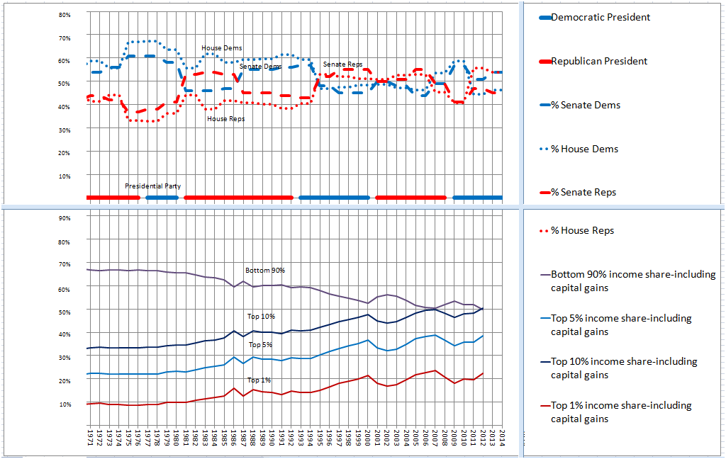
The charts, as shown below, are too large in a web format to see details adequately. However, there are some things seen below that immediately jumped out at me. First, notice the squeeze in the 1920 to 1940 and 1980 to the present, income levels in the United States on Chart 1. What this tells us is that the bottom 90% of income share in the United States came down around the Great Depression and started coming down in Reagan years until the Great Recession of the 2008. Also, notice that the top 10%, 5% and 1% of income share rose during those years resulting in what I term the Great Crunch.
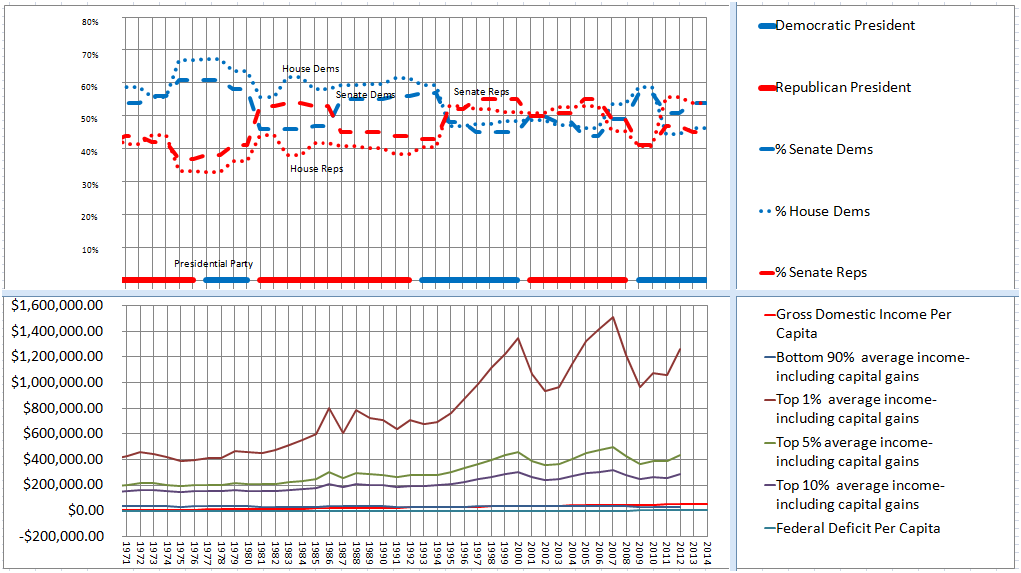
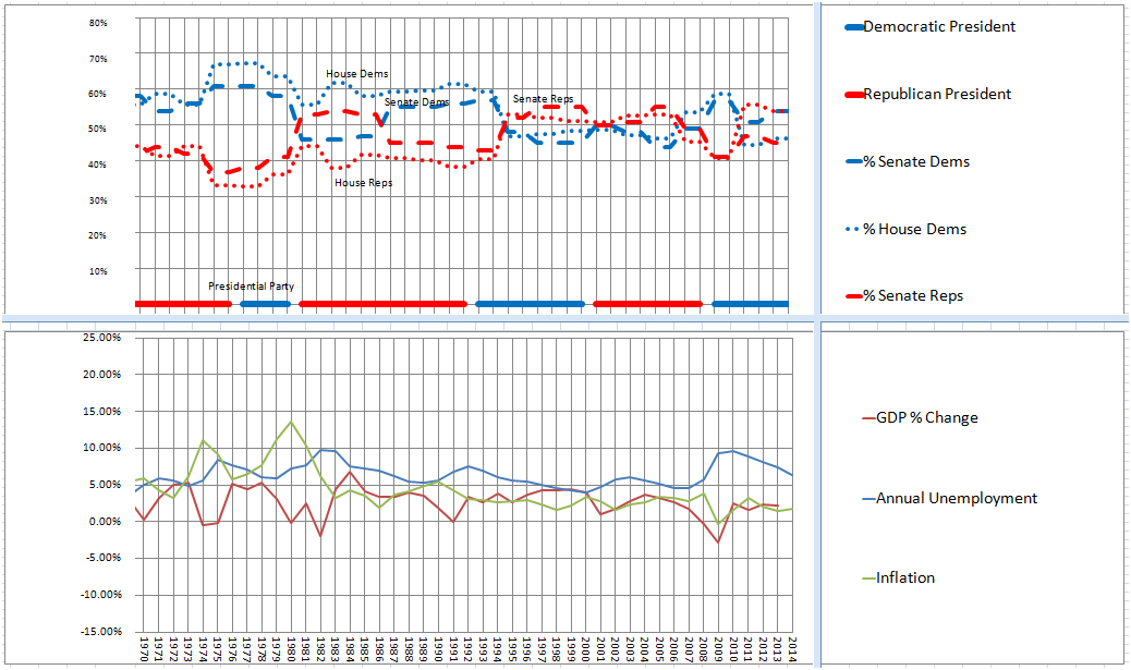
Chart 2 shows the dollar amount of the Great Crunch. The gross domestic income per capita was relatively flat during the Great Depression years and rose slightly from the Reagan years to the present. This was probably the effect of the upper income bracket’s large rise in income share during those years. After the Great Depression, the upper income brackets were taxed in the 90+ percentile tax bracket after a certain amount of income was obtained. Ronald Reagan cut those large taxes on the wealthy and they continued to pay lower and lower taxes from then to the Clinton years when their taxes went up. In the Bush years their taxes went down again. They also accrued more and more tax shelters during these years. If the claim of the right that lower taxes create jobs is correct, we should have seen unemployment go down in the Reagan years. However, the data actually shows that unemployment actually went up in the Reagan years. Conversely, President Clinton raised taxes on the very rich in the 90s and employment went up.15 If the claim of the right is correct, where is the proof? The proof goes counter to their claim.
Chart 2 also shows the bottom 90% average income going down slightly from the gross domestic income per capita and can be seen better in the more detailed view of Chart 2 further below. The spreadsheet tables show the actual dollar amounts started at around $11,000 annually in 1917, went to a low of about $7,500 in the Great Depression, started rising to about $36,500 in 2000 and declined from there to about $31,000 in 2012. The upper 10% income brackets did bump up some just before the Great Depression years in real 2012 dollars but in recent decades since Reagan those brackets rose tremendously with the upper 1% rising 300% to 400% in the decade of 2000 and more than doubling for the top 5% and top 1%.
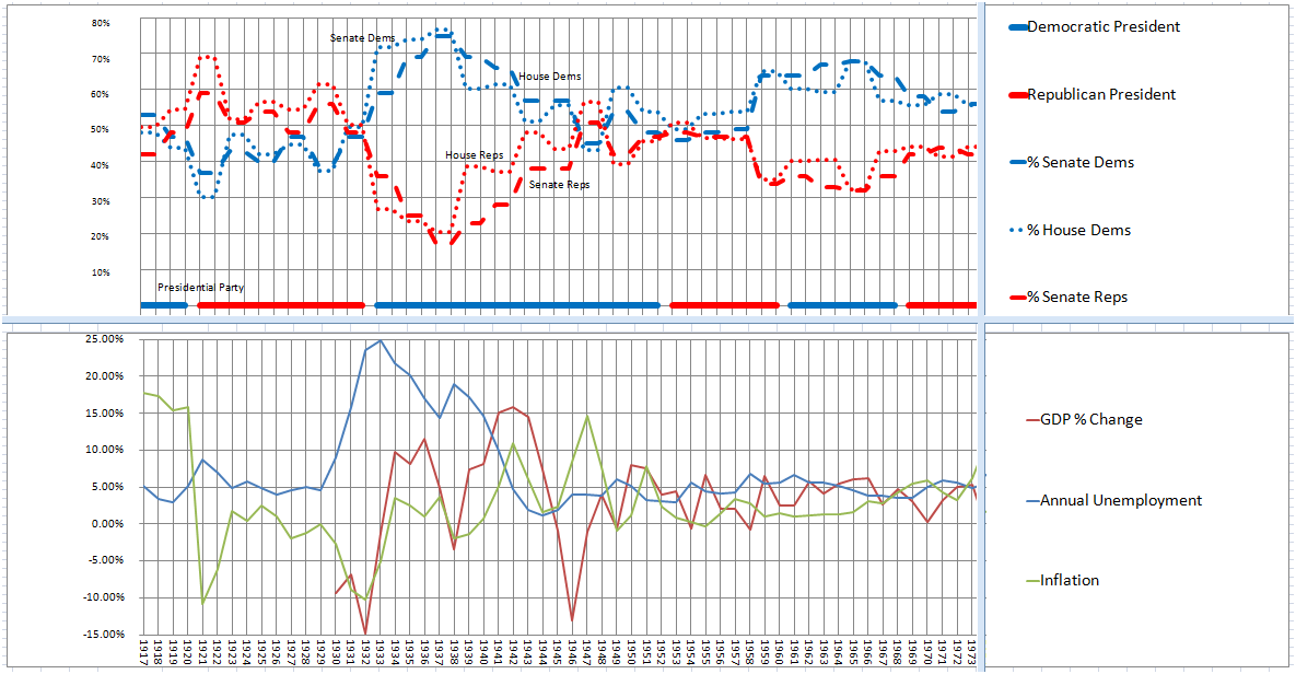
Another claim of the right is that all the meddling of the Federal Reserve results in inflation, boom and busts and unemployment. Chart 3 does not validate this claim. Inflation, unemployment and GDP have been tamed much more since Franklin Delano Roosevelt’s administration greatly empowered the Federal Reserve, created depository insurance and financial regulatory requirements. Inflation, unemployment and GDP were much more erratic from 1917 through the Great Depression (and even before 1917). Do we really want to get rid of the Federal Reserve, depository insurance and financial regulatory requirements as the Austrian Economists suggest and go back to those days?
The charts also show that Democratic Presidents and Democratic Congress’ presided over the recovery from the Great Depression and the Great Recession of 2008. It also shows that Republican Presidents and Republican Congress’ presided just before these economic catastrophes. However, much to my surprise, mixed parties controlled the Congress and the Presidency over much of the more economically stable period from the recovery of the Great Depression to the Reagan years. My personal opinion is that the Old Right16 was much more sympathetic to the bottom 90% than the new right of recent years. Democrats and Republicans were able to pass bills which actually benefitted the middle class in those years and spread the income share between the bottom 90% and the top 10% as evidenced by Chart 1.
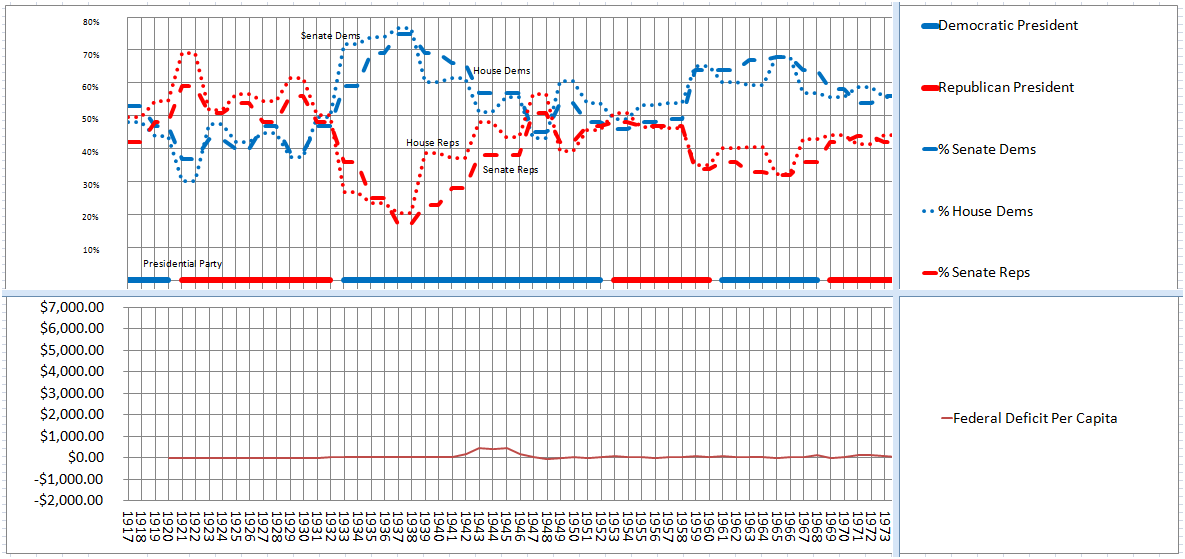
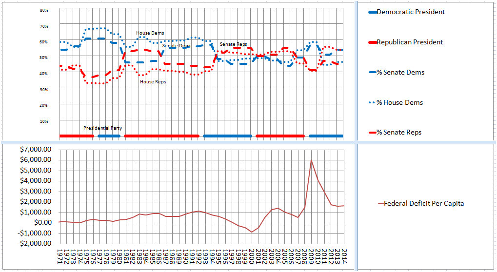
Chart 4 shows the Federal deficit per capita. The right has made much of Obama Care and the Federal Government’s hit on the national debt. The national debt is fueled by the annual deficit. While the deficit per capita bumped up slightly during the Great Depression recovery, it had a surplus of $1,000 per person in 2000 under President Clinton and a debt of $6,000 per person in 2009 under President George W. Bush until President Obama was inaugurated. Since then it has gone down to less than $2,000 per person of debt. This is obviously not what the right has been telling us. The facts actually tell us that the right has told us a blatant lie. The deficit did spike up from the social safety net set in place by Democrats and Republicans over the decades under mandatory spending requirements which no president could unilaterally change; only an act of Congress can change mandatory spending. The social “safety net” as, President Reagan called it, did exactly what is was suppose to do. If it had not done its job, the Great Recession of 2008 would have had a much more severe impact on average working families and probably would have prolonged the effects of the recession. However, the deficit immediately start coming down under President Obama; again, contrary to the blatant lies of the new right.
I believe that the 2014 elections were rigged, thanks to the narrative paid for by virtue of the Citizens United Decision,17 by lies which obviously benefit the wealthy not the working class. There was a right at one time that did care about the middle class and proved it with facts. However, the new right does not resemble that party in reality and the economy. It is high time that the old notion that Republicans are better for the economy get updated to reflect reality and not aspirational nostalgia. I would also add a word of caution I see in the data that the worst may not be over yet. The Great Crunch does not look like it is receding yet. Economists have told us for many years that the engine of the economy is the consumer not the wealthy. The consumer spreads out the risks of the economy and thus minimizes the chance of economic catastrophe. The facts bear this out. If we continue down the path which rewards wealth and punishes the consumer we may not have seen the ‘big one’ yet. A mixed party of Executive and Congressional branches of government may not fan the flames of the Great Crunch but we need to move away from the precipice of decreasing the income of the bottom 90% and increasing the income of the top 10% or we may find ourselves in a depression that will make the Great Depression look like a dress rehearsal.18 If a Republican is elected as President in 2016 with the new majorities of Republicans in the Congress, we could be well on our way to economic catastrophe as history is the witness.
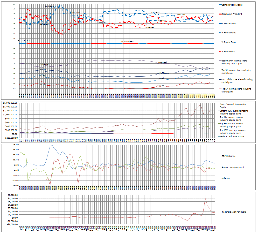
The charts below are the same as the charts above but with more detail. In order to do this, the timelines have been split. Note that not all the data fields are fully filled out due to the lack of earlier reliable data. The top of each chart shows the percentage of Democrat and Republican, U.S. Senators and Representatives. The solid horizontal colored bars shows the presidential party in power at the time. Democrats are displayed in blue and Republicans are displayed in red.
Here are the dates from 1917 to 1971 for Chart 1.
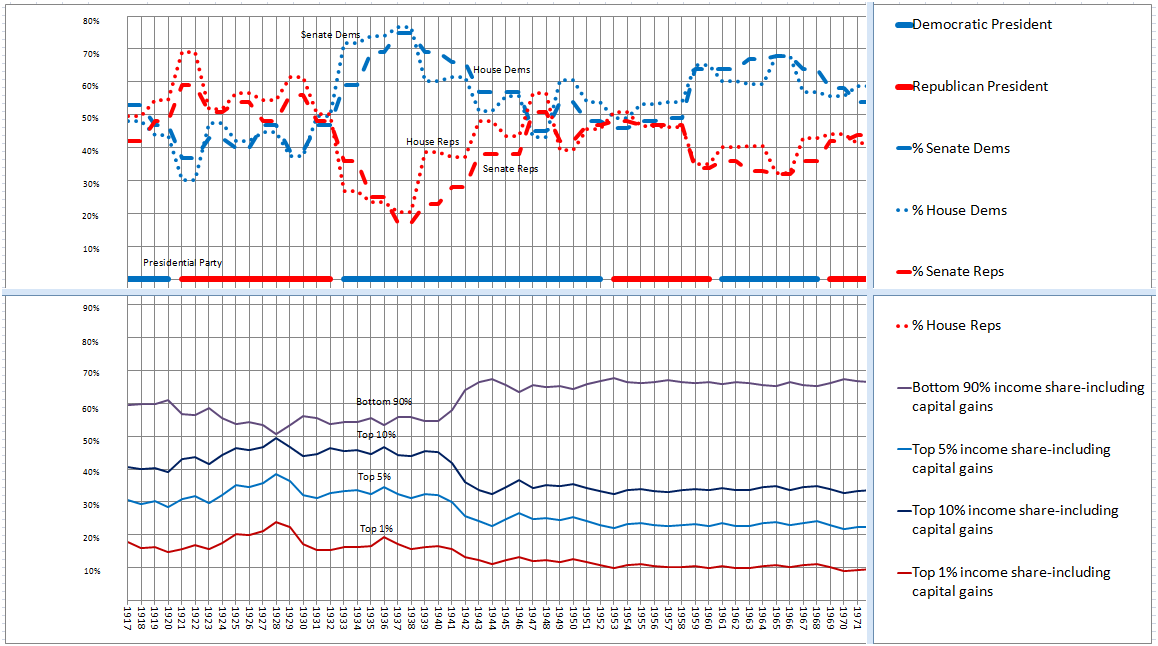
Here are the dates from 1971 to 2014 for Chart 1.
Here are the dates from 1917 to 1973 for Chart 2.
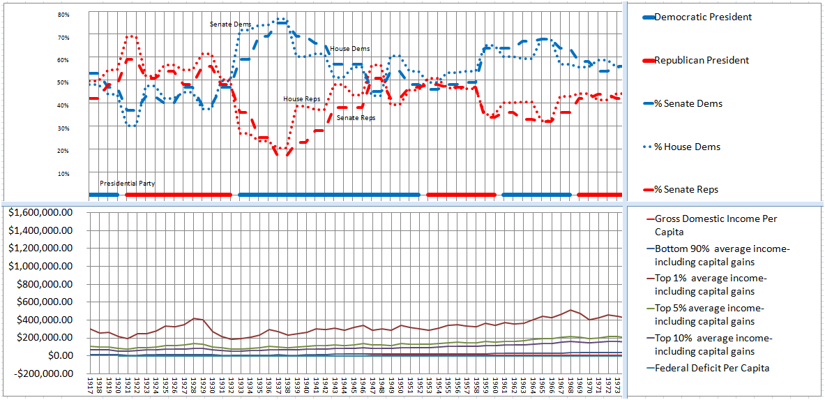
Here are the dates from 1971 to 2014 for Chart 2.
Here are the dates from 1917 to 1973 for Chart 3.
Here are the dates from 1970 to 2014 for Chart 3.
Here are the dates from 1917 to 1973 for Chart 4.
Here are the dates from 1971 to 2014 for Chart 4.
_________________
1 Alvaredo, Facundo, Anthony B. Atkinson, Thomas Piketty and Emmanuel Saez, The World Top Incomes Database, http://topincomes.g-mond.parisschoolofeconomics.eu/, 11/12/2014, See The World Top Incomes Database, real 2012 US Dollars, gross income before taxes, fractiles defined by total income including capital gains; income includes capital gains, the income share is the percentage share of annual income of the bottom 10% in the United States
2 Alvaredo, Facundo, Anthony B. Atkinson, Thomas Piketty and Emmanuel Saez, The World Top Incomes Database, http://topincomes.g-mond.parisschoolofeconomics.eu/, 11/12/2014, See The World Top Incomes Database, real 2012 US Dollars, gross income before taxes, fractiles defined by total income including capital gains; income includes capital gains, the income share is the percentage share of annual income of the top 1% in the United States
3 Alvaredo, Facundo, Anthony B. Atkinson, Thomas Piketty and Emmanuel Saez, The World Top Incomes Database, http://topincomes.g-mond.parisschoolofeconomics.eu/, 11/12/2014, See The World Top Incomes Database, real 2012 US Dollars, gross income before taxes, fractiles defined by total income including capital gains; income includes capital gains, the income share is the percentage share of annual income of the top 5% in the United States
4 Alvaredo, Facundo, Anthony B. Atkinson, Thomas Piketty and Emmanuel Saez, The World Top Incomes Database, http://topincomes.g-mond.parisschoolofeconomics.eu/, 11/12/2014, See The World Top Incomes Database, real 2012 US Dollars, gross income before taxes, fractiles defined by total income including capital gains; income includes capital gains, the income share is the percentage share of annual income of the top 10% in the United States
5 See Gross Domestic Income per capita, FRED Graph Observations, Federal Reserve Economic Data, Economic Research Division, Federal Reserve Bank of St. Louis, Gross Domestic Income (GDI), dollars per person, annual, not seasonally adjusted, the dollar amount is found by dividing each annual GDI by the population for that year as defined by the Census Bureau
6 Alvaredo, Facundo, Anthony B. Atkinson, Thomas Piketty and Emmanuel Saez, The World Top Incomes Database, http://topincomes.g-mond.parisschoolofeconomics.eu/, 11/12/2014, See The World Top Incomes Database, real 2012 US Dollars, gross income before taxes, fractiles defined by total income including capital gains; income includes capital gains, average income-including capital gains
7 Alvaredo, Facundo, Anthony B. Atkinson, Thomas Piketty and Emmanuel Saez, The World Top Incomes Database, http://topincomes.g-mond.parisschoolofeconomics.eu/, 11/12/2014, See The World Top Incomes Database, real 2012 US Dollars, gross income before taxes, fractiles defined by total income including capital gains; income includes capital gains, average income-including capital gains
8 Alvaredo, Facundo, Anthony B. Atkinson, Thomas Piketty and Emmanuel Saez, The World Top Incomes Database, http://topincomes.g-mond.parisschoolofeconomics.eu/, 11/12/2014, See The World Top Incomes Database, real 2012 US Dollars, gross income before taxes, fractiles defined by total income including capital gains; income includes capital gains, average income-including capital gains
9 Alvaredo, Facundo, Anthony B. Atkinson, Thomas Piketty and Emmanuel Saez, The World Top Incomes Database, http://topincomes.g-mond.parisschoolofeconomics.eu/, 11/12/2014, See The World Top Incomes Database, real 2012 US Dollars, gross income before taxes, fractiles defined by total income including capital gains; income includes capital gains, average income-including capital gains
10 See Federal Deficit per capita, the dollar amount is found by dividing each annual deficit by the population for that year as defined by the Census Bureau
11 See GDP from 1929 to the present(xls), U.S. Bureau of Economic Analysis, GDP in billions of chained 2009 dollars
12 See Bureau of Labor Statistics, Unemployment Rate
13 See Inflation
14 See Federal Deficit per capita, the dollar amount is found by dividing each annual deficit by the population for that year as defined by the Census Bureau
15 See THE TRUTH ABOUT TAXES: History Suggests High Tax Rates On Rich People Do Not Hurt The Economy, See The Numbers Don’t Lie-Why Lowering Taxes For The Rich No Longer Works To Grow The Economy
16 See Conservatism and Liberalism: A Historical Perspective
17 See Formalism: When a Lie Becomes Truth (really)
18 See Plutocracy and Democracy: A Credit Suisse Report
From this site:
Financial Great Depression Facts
* In the 1920s, the wealthiest one percent owned more than a third of American assets.
* When stock speculator was a prominent practice, banks lent money to investors to buy stock. Nearly $4.00 out of every $10.00 borrowed from the banks was used to buy stock
* The average income of the American family dropped by 40 percent from 1929 to 1932. Income fell from $2,300 to $1,500 per year.
* During the 1930s, manufacturing employees earned about $17 per week. Doctors earned $61 per week.
* The stock market didn’t return to pre-depression levels until 1954.
– See more at: http://great-depression-facts.com/#sthash.2qT5aOAn.dpuf
Marriner S. Eccles, who served as Franklin D. Roosevelt’s Chairman of the Federal Reserve from November 1934 to February 1948, detailed what he believed caused the Depression in his memoirs, Beckoning Frontiers (New York, Alfred A. Knopf, 1951).
As mass production has to be accompanied by mass consumption, mass consumption, in turn, implies a distribution of wealth — not of existing wealth, but of wealth as it is currently produced — to provide men with buying power equal to the amount of goods and services offered by the nation’s economic machinery. [Emphasis in original.]
Instead of achieving that kind of distribution, a giant suction pump had by 1929-30 drawn into a few hands an increasing portion of currently produced wealth. This served them as capital accumulations. But by taking purchasing power out of the hands of mass consumers, the savers denied to themselves the kind of effective demand for their products that would justify a reinvestment of their capital accumulations in new plants. In consequence, as in a poker game where the chips were concentrated in fewer and fewer hands, the other fellows could stay in the game only by borrowing. When their credit ran out, the game stopped.
That is what happened to us in the twenties. We sustained high levels of employment in that period with the aid of an exceptional expansion of debt outside of the banking system. This debt was provided by the large growth of business savings as well as savings by individuals, particularly in the upper-income groups where taxes were relatively low. Private debt outside of the banking system increased about fifty per cent. This debt, which was at high interest rates, largely took the form of mortgage debt on housing, office, and hotel structures, consumer installment debt, brokers’ loans, and foreign debt. The stimulation to spend by debt-creation of this sort was short-lived and could not be counted on to sustain high levels of employment for long periods of time. Had there been a better distribution of the current income from the national product — in other words, had there been less savings by business and the higher-income groups and more income in the lower groups — we should have had far greater stability in our economy. Had the six billion dollars, for instance, that were loaned by corporations and wealthy individuals for stock-market speculation been distributed to the public as lower prices or higher wages and with less profits to the corporations and the well-to-do, it would have prevented or greatly moderated the economic collapse that began at the end of 1929.
The time came when there were no more poker chips to be loaned on credit. Debtors thereupon were forced to curtail their consumption in an effort to create a margin that could be applied to the reduction of outstanding debts. This naturally reduced the demand for goods of all kinds and brought on what seemed to be overproduction, but was in reality underconsumption when judged in terms of the real world instead of the money world. This, in turn, brought about a fall in prices and employment.
Unemployment further decreased the consumption of goods, which further increased unemployment, thus closing the circle in a continuing decline of prices. Earnings began to disappear, requiring economies of all kinds in the wages, salaries, and time of those employed. And thus again the vicious circle of deflation was closed until one third of the entire working population was unemployed, with our national income reduced by fifty per cent, and with the aggregate debt burden greater than ever before, not in dollars, but measured by current values and income that represented the ability to pay. Fixed charges, such as taxes, railroad and other utility rates, insurance and interest charges, clung close to the 1929 level and required such a portion of the national income to meet them that the amount left for consumption of goods was not sufficient to support the population.
This then, was my reading of what brought on the depression.